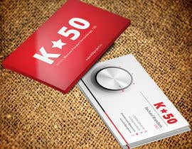
Business cards design for K50 (Разработка визитных карточек)
- Status: Closed
- Prize: $50
- Entries Received: 61
- Winner: pankaj86

Contest Brief
We would like to get design of our business cards loosely based on our website design http://www.k50project.ru/
logo in vector is atteched
There should be following info to be present on business card:
Richard Brandson
CEO
K50
www.k50project.ru
+7 (111) 111-11-11
+7 (111) 111-11-11
brandson@k50project.ru
111111, Moscow, Prospect Vernadskogo, 12D
Recommended Skills
Employer Feedback
“@pankaj86 won the contest on 9 October 2013”
![]() sbranovitskiy, Russian Federation.
sbranovitskiy, Russian Federation.
Public Clarification Board
-

pankaj86
- 10 years ago
Hi , Will you please provide me feedback ?? i have already given feedback to you.
I really appreciate that
thank you .- 10 years ago
-

FreelancerDavit
- 10 years ago
sbranovitskiy 5+ you are not left unanswered none. bravo!!! like this to be an employer!!!!!
- 10 years ago
-

Contest Holder - 10 years ago
Guys! Thank you very much for your work!!! It is superb!
Actually there are lots of entries that are good to be winners. Unfortunately I could only choose one.
Thank you again!!!- 10 years ago
-

nishantbala
- 10 years ago
Hi I have submitted 3 entries, #22 , #24 and #32 . Please give me your valuable feedback so that i can alter according to your taste.
Regatds,
Nishant Balasubramanian.- 10 years ago
View 4 more messages
-
nishantbala
- 10 years ago
Hello, My entry #46 isn't visible through any of my browsers, so I have re-uploaded as #76 , Please have a look.
Regards,
Nishant Balasubramanian.- 10 years ago
-
nishantbala
- 10 years ago
Sorry its back now!
- 10 years ago
-

FireDesigner
- 10 years ago
feedback #68...thanks
- 10 years ago
-

palit001
- 10 years ago
hello sir please check #67
- 10 years ago
-

Masumulhaque
- 10 years ago
Hi,
Please check #63 #64 #65 .- 10 years ago
-

rishavkumar93
- 10 years ago
- 10 years ago
-
rishavkumar93
- 10 years ago
Check #53 and tell me how it is...
- 10 years ago
-
Masumulhaque
- 10 years ago
Hi,
Please check #42 #43 and let me know your opinion.- 10 years ago
-
Contest Holder - 10 years ago
Thank you! Very good! I like some other entries more, but unfortunately I can't describe why. Just internal felling, sorry.
- 10 years ago
-
Masumulhaque
- 10 years ago
- 10 years ago
-

linokvarghese
- 10 years ago
- 10 years ago
-
Contest Holder - 10 years ago
Very original! Thank you, linokvarghese!
- 10 years ago
-
pankaj86
- 10 years ago
Hi, Please check #37 .. let me know if there anything to change or add . thnks .
- 10 years ago
-
Contest Holder - 10 years ago
pankaj38, thank you! they are all beautiful, can't think of any changes to make
- 10 years ago
-
pankaj86
- 10 years ago
Ok thank you for feedback i have also submitted in tshirt :)
- 10 years ago
-

davimarz
- 10 years ago
hi, forgive me, but I do not have software or sites that can simulate the press of my accomplishments, #23, #14, so I'm just as he sees them, realized in a simple way and partly in vector, I hope it will also consider this my lack?
davide- 10 years ago
-
Contest Holder - 10 years ago
Davide, Thank you! They are nice. However, I am not sure about the side with logo. It is beautiful, but a bit holywood-style and not business card-style imho.
- 10 years ago
-
davimarz
- 10 years ago
ok, change immediately, thank you for your kind reply
- 10 years ago
-

Studio7L
- 10 years ago
What about #39 #40 thanks
- 10 years ago
-
Contest Holder - 10 years ago
Studio7K, thank you! very good and original! nothing to add.
- 10 years ago
-
Masumulhaque
- 10 years ago
Hi,
Please check #36 and give me feedback.- 10 years ago
-
Contest Holder - 10 years ago
Masumulhaque, thank you! very creative with cut corners. However, I like more white&red, than black&red.
- 10 years ago
-

valentinafurno
- 10 years ago
Greetings, could you please check #34 and #35?
- 10 years ago
-
Contest Holder - 10 years ago
valentinafurno, thank you! but now they are in withdrawn and I can't see them
- 10 years ago
-

stoyanvasilev98
- 10 years ago
Please rate #28 . Hope you like it.
Best regards,
Stoyan Vassilev- 10 years ago
-
Contest Holder - 10 years ago
coooool!!!
- 10 years ago
-

inzikhan
- 10 years ago
CHeck #29 ...back is same...i will also give you in white shape..
- 10 years ago
-
Contest Holder - 10 years ago
inzikhan, thank you!!! seems a bit overblack
- 10 years ago
-
davimarz
- 10 years ago
please, check #23 and give me feedback , thanks
- 10 years ago
-
Contest Holder - 10 years ago
davimarz, thank you! the side with logo is a bit controversial due to red + metallic mixture. Seems a bit strange to me. But maybe it's my perverted vision
- 10 years ago
-
pankaj86
- 10 years ago
- 10 years ago
-
Contest Holder - 10 years ago
Very cool! thank you
- 10 years ago
-
nishantbala
- 10 years ago
Please valuate #24 and give me feedback.
Regards,
Nishant Balasubramanian.- 10 years ago
-
nishantbala
- 10 years ago
Please valuate #22 and give me feedback.
Regards,
Nishant Balasubramanian.- 10 years ago
-

homiemomie
- 10 years ago
i hope my entry finds you well :)
- 10 years ago
-
Contest Holder - 10 years ago
Thanks!
- 10 years ago
-
homiemomie
- 10 years ago
please evaluate my work and lets see how else can we improve it. Thanks! #1
- 10 years ago
-
Contest Holder - 10 years ago
#18 with a star - is very interesting anfd inspiring! Thank you!
- 10 years ago
-
FreelancerDavit
- 10 years ago
It Really Funny !!I can not Understand You People ar so Strange? If you Like This #15 Much more Then #17 #16 #3 #6 #9 #14 #10 # 2 why Just no go Or Call in Card Macker Compani And sed. I Want Card one side Black One White, And This Contacts on a White side. why Pay 50$ Why Just not go and Give This money to homeless children? Where is the design and Where in the logic??? (rajnandanpatel no offense I know you are a good Designer) :)
- 10 years ago
-
Contest Holder - 10 years ago
thank you! just to be on a safe side... yesterday I gave $3 in charity )))
- 10 years ago
-

rajnandanpatel
- 10 years ago
Please feedback #15
- 10 years ago
-
Contest Holder - 10 years ago
rajnandanpatel, thank you!
It is good! Though I think the red side could be better, now the logo seem a bit small to me, comparing to big red background- 10 years ago
How to get started with contests
-

Post Your Contest Quick and easy
-

Get Tons of Entries From around the world
-

Award the best entry Download the files - Easy!