Create an SVG logo

  • Status: Closed
  • Prize: $70
  • Entries Received: 126
  • Winner: hbakbar28

Contest Brief

I require a logo for my startup in SVG format. I don't have a specific design in mind so will require some design concepts as part of this project.

Having said that, I do have a few design requirements:
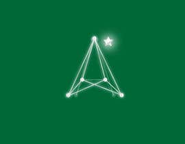
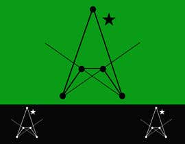
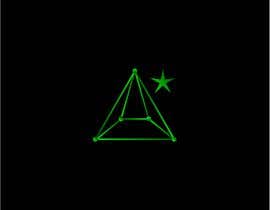
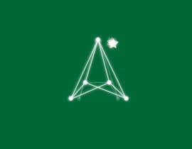
1) The user should be able to read A*, looking at the logo.
2) It must draw inspiration from the A* search algorithm (think networks).
2) The logo will be used with a forest green background, and as such, the design must use colors that work well. No bright colors like orange, yellow, red, etc.

Have a look at https://imgur.com/a/m69TBWb and picture it with a dark forest green background. The idea of a 'network' is vital.

Please refer to Public Clarification Board for up-to-date ideas.

Recommended Skills

Employer Feedback

“He understood my vision and could see what I was aiming for.”

Profile image lambdalogic, Australia.

Top entries from this contest

View More Entries

Public Clarification Board

  • lambdalogic
    Contest Holder
    • 5 years ago

    Ok guys, not long to go now before the end of contest. Here's what you need to do to grab the award. Merge aspects of #98 (the two overlapping segments idea), #115 (the spherical look of the vertices), and #127 (lines that get slightly thicker to the middle and taper off towards vertices, as well as the angled 3D look).

    • 5 years ago
    1. kenitg
      kenitg
      • 5 years ago

      I realize all your requirements in these proposals. please check them.
      #144 and #146 is the same but with a star.
      #145 and last and diferent #147

      • 5 years ago
    2. hbakbar28
      hbakbar28
      • 5 years ago

      dear contest holder why not you complete the contest ??

      • 5 years ago
  • kenitg
    kenitg
    • 5 years ago

    I realize all your requirements in these proposals. please check them.
    #144 and #146 is the same but with a star.
    #145 and last and diferent #147

    • 5 years ago
  • kenitg
    kenitg
    • 5 years ago

    Please check
    #144 and #146 is the same but with a star.
    #145 and last and diferent #147

    • 5 years ago
  • mahmuds007
    mahmuds007
    • 5 years ago

    #155

    • 5 years ago
  • kenitg
    kenitg
    • 5 years ago

    Please check
    #144 and #146 is the same but with a star.
    #145 and last and diferent #147

    • 5 years ago
  • Shiblu1751
    Shiblu1751
    • 5 years ago

    Hi, please check 125.Thanks

    • 5 years ago
  • kenitg
    kenitg
    • 5 years ago

    Please check last #139

    • 5 years ago
  • graphicpro99
    graphicpro99
    • 5 years ago

    @Hasib already copied my idea did you see that ? CH??

    • 5 years ago
    1. lambdalogic
      Contest Holder
      • 5 years ago

      There's a difference between drawing inspiration and straighout copying. Your first submission ( #47 ) didn't portray the idea of a network, which is why I've rated your second submission ( #93 ) higher. I would have rated it even higher if you hadn't changed the star back to an asterisk.

      • 5 years ago
    2. hbakbar28
      hbakbar28
      • 5 years ago

      hey i am not copied your idea....just watch contest holder description and sample design,this contest's design is based on network so in some part our design will similar

      • 5 years ago
  • lambdalogic
    Contest Holder
    • 5 years ago

    I like the complexity of #91 but also the simplicity of #90 : - D

    • 5 years ago
  • lambdalogic
    Contest Holder
    • 5 years ago

    The winner of this award may not necessarily be what I consider to be the best looking logo. This is just a test to see who I'd like to form a long-term relationship with to carry on working on my project. One of the most important qualities I'm looking for is not being dismissive of clearly specified requirements, while also adjusting to requirements as they change. Put simply, the winner of this award may not be the one I decide to give all my future design work to.

    • 5 years ago
  • lambdalogic
    Contest Holder
    • 5 years ago

    Please note, simply copying someone else's idea and making slight adjustments won't earn you the award. Be original.

    • 5 years ago
    1. hbakbar28
      hbakbar28
      • 5 years ago

      thanks a lot for this comment.it will inspire us to create original design :)

      • 5 years ago
  • aktarhossain1198
    aktarhossain1198
    • 5 years ago

    #83

    • 5 years ago
  • colorss
    colorss
    • 5 years ago

    Check my entry #81

    • 5 years ago
  • aktarhossain1198
    aktarhossain1198
    • 5 years ago

    Dear sir please check #59 #63 #65 #76 . for any change please message me. thanks

    • 5 years ago
  • lambdalogic
    Contest Holder
    • 5 years ago

    To reiterate: Have a look at https://imgur.com/a/m69TBWb. And picture it with a dark forest green background. The idea of a 'network' is vital.

    • 5 years ago
    1. lambdalogic
      Contest Holder
      • 5 years ago

      How does this even remotely resemble what I'm after?

      • 5 years ago
  • lambdalogic
    Contest Holder
    • 5 years ago

    @hbakbar28 and @colorss are on the right track with capturing what I'm envisioning. A few clarifications: I'd like to minimize the use of circles in the logo. Circular (network) nodes while needed, shouldn't take up much room in the logo. They should be small. I'd prefer the star to look more like the Mercedes star rather than an asterisk, but with 5 prongs instead of 3 (if that makes sense). And overall I'd like some shading and blending similar to: https://geekfell.com/wp-content/uploads/2017/09/Cover-Image-%E2%80%93-3-min.png

    • 5 years ago
    1. hbakbar28
      hbakbar28
      • 5 years ago

      thanks for your important feedback,i will show you upgrade design ASAP

      • 5 years ago
    2. lambdalogic
      Contest Holder
      • 5 years ago

      No worries. I'm very mindful of submissions where people have simply copied ideas of others, and I will be awarding taking this into account. Your submission is one of the few that portrays the idea of a 'network'. Please see the imgur link I've posted.

      • 5 years ago
  • sadadsaeid769815
    sadadsaeid769815
    • 5 years ago

    piease ckeck #40 ,##41, #45 , #46 , #49

    • 5 years ago
    1. lambdalogic
      Contest Holder
      • 5 years ago

      Thanks. Unfortunately none of these portray the idea of a 'network'.

      • 5 years ago
  • colorss
    colorss
    • 5 years ago

    Check my entry #36

    • 5 years ago
    1. lambdalogic
      Contest Holder
      • 5 years ago

      I don't want the matrix in my logo, I suggested that purely to give an idea of color scheme. Also, no big circles like I've mentioned in a previous clarification. Have a look at my imgur link below.

      • 5 years ago
  • lambdalogic
    Contest Holder
    • 5 years ago

    And as per original contest description, I urge you to think forest green background. Think 'The Matrix': https://www.123rf.com/photo_32774326_background-of-a-green-matrix-of-binary-figures.html

    • 5 years ago
  • lambdalogic
    Contest Holder
    • 5 years ago

    This is what I'm thinking: https://imgur.com/a/m69TBWb

    • 5 years ago
  • lambdalogic
    Contest Holder
    • 5 years ago

    Look at entry #22 , that's the star shape I'm looking for.

    • 5 years ago
  • lambdalogic
    Contest Holder
    • 5 years ago

    This contest is just for me to to select freelancers I'll need for designing themes for my company. So there will most definitely be further work for those who do well here :-)

    • 5 years ago

Show more comments

How to get started with contests

  • Post your contest

    Post Your Contest Quick and easy

  • Get tons of entries

    Get Tons of Entries From around the world

  • Award the best entry

    Award the best entry Download the files - Easy!

Post a Contest Now or Join us Today!