Design a Logo and Website for New Product / Company

  • Status: Closed
  • Prize: $200
  • Entries Received: 102
  • Winner: nupur01677559

Contest Brief

We would like our existing company website www.omnicon.net.au updated and a logo and website developed for our new company which is called Omniview. Omniview is also the name of the software package that we'll be marketing from that website. The Omniview software package is a 3D HMI / SCADA application that allows the display of 2D and 3D information for use by operators in industrial control systems.

I would like both websites to be updated to have a similar look and feel and ideally the same back end. We need to be easily able to add to the menus, headings, and content generally. We'd like to be able to add things like posts / blog entries / news etc.

We'd like the websites to also work on mobile devices.

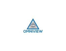
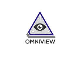
The logo for the Omniview company and software is probably the most critical element of the project.

A key point of difference for our software compared to others is the ability to display 3D data as well as 2D data. To date, we've principally used and developed it for use in the materials handling industry (see screenshots) to show the positions of stacking and reclaiming machines and the bulk stockpiles that they work on. However, we are hoping that it will have uses in other industries also.

SCADA (Supervisory Control and Data Acquisition) and HMI (Human Machine Interface) software refers to the software that typically runs on computers or industrial panels (i.e. dedicated screens) / touchscreens and shows the state / operation of an industrial control system such as a machine, manufacturing plant, process etc. The information displayed include numeric data (temperatures, pressures, settings), trended / graphed data, and plant "mimics" (simplified representations of the plant or system). The interface also allows control of the plant via pushbuttons and other controls such as sliders shown on the screens.

One of the concepts / ideas that we had for the logo was to try and incorporate something that looked like the "Eye of Providence" which is the pyramid with the eye on the back of the US $1 note and other places. We liked the eye, because we felt that it was a good match with the visualisation / insight / being able to see what is going on as you should be with a good SCADA / HMI interface. We thought the pyramid was also a good fit because our software allows displaying of 3-dimensional data. We thought that perhaps the sides of the pyramid could have some very simplified SCADA elements such as a graph trending up or something similar.

We are definitely open to other suggestions. The detail above is provided more or less as background information. Whatever logo we end up with, we'd like it to be used on (or have simplified versions for use on) the website, corporate stationary, email signatures, our application icon (i.e. desktop shortcut as well as window corner, start menu etc) and on T-shirts and other marketing material. It would also be great if we could have a simplified animated version of the logo that could be used instead of the hourglass / waiting icon e.g. for use while the software is loading etc. If possible we'd like the native files for any logos / deliverables for this project contest.

Recommended Skills

Employer Feedback

“We thought Najnin worked hard, was responsive and came up with some of the best entries in the competition.”

Profile image ocn777, Australia.

Top entries from this contest

View More Entries

Public Clarification Board

  • Garibaldi17
    Garibaldi17
    • 6 years ago

    And what about the sketch ... ??

    • 6 years ago
  • Awshaf95
    Awshaf95
    • 6 years ago

    please extend the date. i have 2 designs to submit

    • 6 years ago
  • studiobiz
    studiobiz
    • 6 years ago

    please check #167 #168

    • 6 years ago
  • mostafanaga2006
    mostafanaga2006
    • 6 years ago

    #154

    • 6 years ago
  • mostafanaga2006
    mostafanaga2006
    • 6 years ago

    #153

    • 6 years ago
  • nextdesign2007
    nextdesign2007
    • 6 years ago

    Please check it Entry #138 .

    • 6 years ago
  • NeriDesign
    NeriDesign
    • 6 years ago

    Check #139 . Thanks!

    • 6 years ago
  • nextdesign2007
    nextdesign2007
    • 6 years ago

    Please check it Entry #138 .

    • 6 years ago
  • ocn777
    Contest Holder
    • 6 years ago

    Hi - we are liking the logos that have incorporated the eye element. We were wondering whether it would be possible to modify some of these to incorporate a slight 3D element on the triangle (similar to the base of the pyramid on the US$1 note. I've uploaded a sketch I just did that sort of combines the elements of some of the entries plus this slight 3d section of the pyramid / triangle. We like the "rays" coming out of the eye and the eye in #124 and #125 but probably the eye needs to be a different colour than the triangle / rays / font - maybe black?. We like the slightly darker blue and grey colours and also the font used in entry #70. Thanks everyone for your efforts.

    • 6 years ago
  • NeriDesign
    NeriDesign
    • 6 years ago

    Please check my entries #126 #127 #128 #129 . Thanks

    • 6 years ago
  • Tamim002
    Tamim002
    • 6 years ago

    Entry #122

    • 6 years ago
  • nextdesign2007
    nextdesign2007
    • 6 years ago

    Please check it Entry #87 .

    • 6 years ago
  • Awshaf95
    Awshaf95
    • 6 years ago

    Please check my entry #83 #85 #86

    • 6 years ago
  • nextdesign2007
    nextdesign2007
    • 6 years ago

    Please check it Entry #87 .

    • 6 years ago
  • ocn777
    Contest Holder
    • 6 years ago

    We just added an attachment to the project showing a Google search of images for the "Eye of Providence" that was discussed in the contest text. We'd really like to see if this could inspire some entries. Thanks.

    • 6 years ago
    1. mdmahmudhasan880
      mdmahmudhasan880
      • 6 years ago

      Please sir check my Entry

      • 6 years ago
  • Awshaf95
    Awshaf95
    • 6 years ago

    Please check it Entry #62 .

    • 6 years ago
  • nextdesign2007
    nextdesign2007
    • 6 years ago

    Please check it Entry #61 .

    • 6 years ago
  • studiobiz
    studiobiz
    • 6 years ago

    please check #56 #57 #58

    • 6 years ago
  • ocn777
    Contest Holder
    • 6 years ago

    We liked entry 46 because it looked like the logo had some relationship to the software product i.e. the triangles looked like the stockpiles. We would like to see more entries that were more than just the company name and had a graphic / image - such as what we suggested in the competition outline. We are really keen to also get some entries that show what the website would look like as well.

    • 6 years ago
  • zaforahamed
    zaforahamed
    • 6 years ago

    please check#46

    • 6 years ago
  • abuhanifsdesign
    abuhanifsdesign
    • 6 years ago

    Sir,please check my Entry #23 and Entry #9

    • 6 years ago

Show more comments

How to get started with contests

  • Post your contest

    Post Your Contest Quick and easy

  • Get tons of entries

    Get Tons of Entries From around the world

  • Award the best entry

    Award the best entry Download the files - Easy!

Post a Contest Now or Join us Today!