Design a Website Mockup for a Legal Startup

  • Status: Closed
  • Prize: $100
  • Entries Received: 39
  • Winner: kubulu

Contest Brief

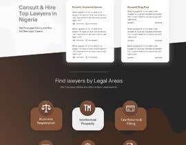
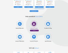
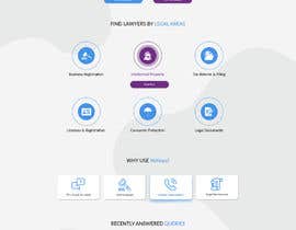
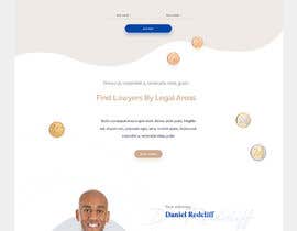
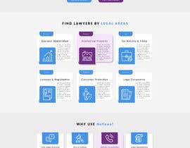
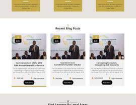
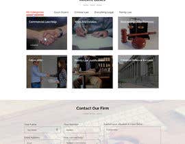
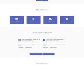
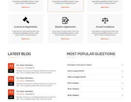
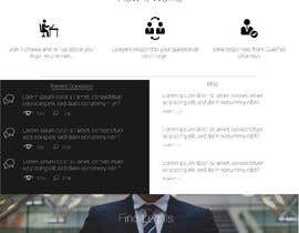
The requirement for this contest is to design a home page mockup for an Internet Startup that provides law related and legal services. Attached are source files for our logo as well as a wireframe / sketch of possible layouts of the website.

A few designs we like:
- lawscout.ca
- lawdingo.com
- founded.co
- pocketlawyer.com
- legistify.com
- priorilegal.com
- lawrato.com

Notes:
- We do not have a preference for any color
- The name is "noyawa.ng"

Feel free to get creative and not follow the wireframe. The winner and possibly other participants of this contest will receive follow-up work for other sections of the website.

Thank you!

Recommended Skills

Employer Feedback

“He's a professional designer who I would continue to work with as the need arises. It was a pleasure to work with Kubulu. ”

Profile image RaalFy, Nigeria.

Top entries from this contest

View More Entries

Public Clarification Board

  • kubulu
    kubulu
    • 5 years ago

    Hi
    I have made the changes.
    Please go through #45
    Thanks

    • 5 years ago
  • AnABOSS
    AnABOSS
    • 5 years ago

    Please check this one #39 I hope you like it. If anything change please knock me. Thanks

    • 5 years ago
  • jitp
    jitp
    • 5 years ago

    sir, I am working.

    • 5 years ago
  • RaalFy
    Contest Holder
    • 5 years ago

    Hi everyone, thanks to all the participants, we're impressed with many designs here. This is my feedback for the top entries:

    - #29 : This is a modern and fresh design, however the choice of icons is a little too distracting. I think photos of a person, or persons at the icons area would have been much better. All those icons on top the scale are a little too many and hurt the simplistic nature of the design. The "How it works" section is also too busy and not clear. The layout on priorilegal.com is simpler and cleaner. The text on the "Recently answered Queries" is a little hard to see given the size of the text and the background. Again, the Find lawyers by legal area uses distracting icons and the layout of this area isn't as nice/simple. Overall a good entry, thank you!

    • 5 years ago
    1. RaalFy
      Contest Holder
      • 5 years ago

      #19 : A good design. I think the decision to add some human elements to the top area is great, making it blend in on the background. Although it doesn't look as clean. It's a promising concept.

      • 5 years ago
    2. Isha3010
      Isha3010
      • 5 years ago

      Please check #34 entry as well.

      • 5 years ago
  • AnABOSS
    AnABOSS
    • 5 years ago

    Hi, I just want to know that this is your personal website. Only your information there no others ?

    • 5 years ago
  • Dmamun18
    Dmamun18
    • 5 years ago

    Hello, I am working on your project please wait for my entry. Thank you

    • 5 years ago
  • RaalFy
    Contest Holder
    • 5 years ago

    Thanks for all the entries. Many of these designs are good but I think they're a bit too busy. I look forward to clean and simple designs like:
    - founded.co
    - priorilegal.com
    - piggybank.ng

    • 5 years ago
    1. raquelroy
      raquelroy
      • 5 years ago

      mine was followed your wireframe... so that wireframe is not clean and simple?

      • 5 years ago
    2. Webguru71
      Webguru71
      • 5 years ago

      Thanks for rate us.We are following your example.Soon we will submit our update design.Thanks.

      • 5 years ago
  • Webguru71
    Webguru71
    • 5 years ago

    Please check out our unique design #14 . Thank you.

    • 5 years ago
  • raquelroy
    raquelroy
    • 5 years ago

    Please check out my entry #13 . Thank you.

    • 5 years ago
  • Webguru71
    Webguru71
    • 5 years ago

    Please give feedback #9

    • 5 years ago
  • zonicdesign
    zonicdesign
    • 5 years ago

    Can you check #3, if you want something to change just tell me i will do it :)

    • 5 years ago
    1. ehioche
      ehioche
      • 5 years ago

      try working around aa DARK BROWN colour

      • 5 years ago
    2. zonicdesign
      zonicdesign
      • 5 years ago

      Check #6

      • 5 years ago
  • bicco
    bicco
    • 5 years ago

    Hi CH, Is the .sketch file accepted instead of .psd ?

    • 5 years ago
    1. ehioche
      ehioche
      • 5 years ago

      psd is more preferable.

      • 5 years ago
  • anditweb
    anditweb
    • 5 years ago

    we are working

    • 5 years ago
  • MagicalDesigner
    MagicalDesigner
    • 5 years ago

    sir please #sealed the project i am working on your design thanks sir

    • 5 years ago

Show more comments

How to get started with contests

  • Post your contest

    Post Your Contest Quick and easy

  • Get tons of entries

    Get Tons of Entries From around the world

  • Award the best entry

    Award the best entry Download the files - Easy!

Post a Contest Now or Join us Today!