Freelancer: MladjaCode
Share:
Report Entry

TileMladjaCode

Hi brodiej! Take a look at this, it should be what you're looking for. Here's a few notes. All the important functions from original site are here and their pantone PMS 286 color is here too to some degree, It looks great on all desktop resolutions, I believe users are more focused on central layout like this one, where all the products are. /// It's worth pointing out that my psd file and layers are very organized, and you should have no trouble navigating yourself through it. /// Regarding the page of one specific product, this contest is near end, but if you like the design, I'll post it in comments section soon enough. Kind regards. MladjaCode
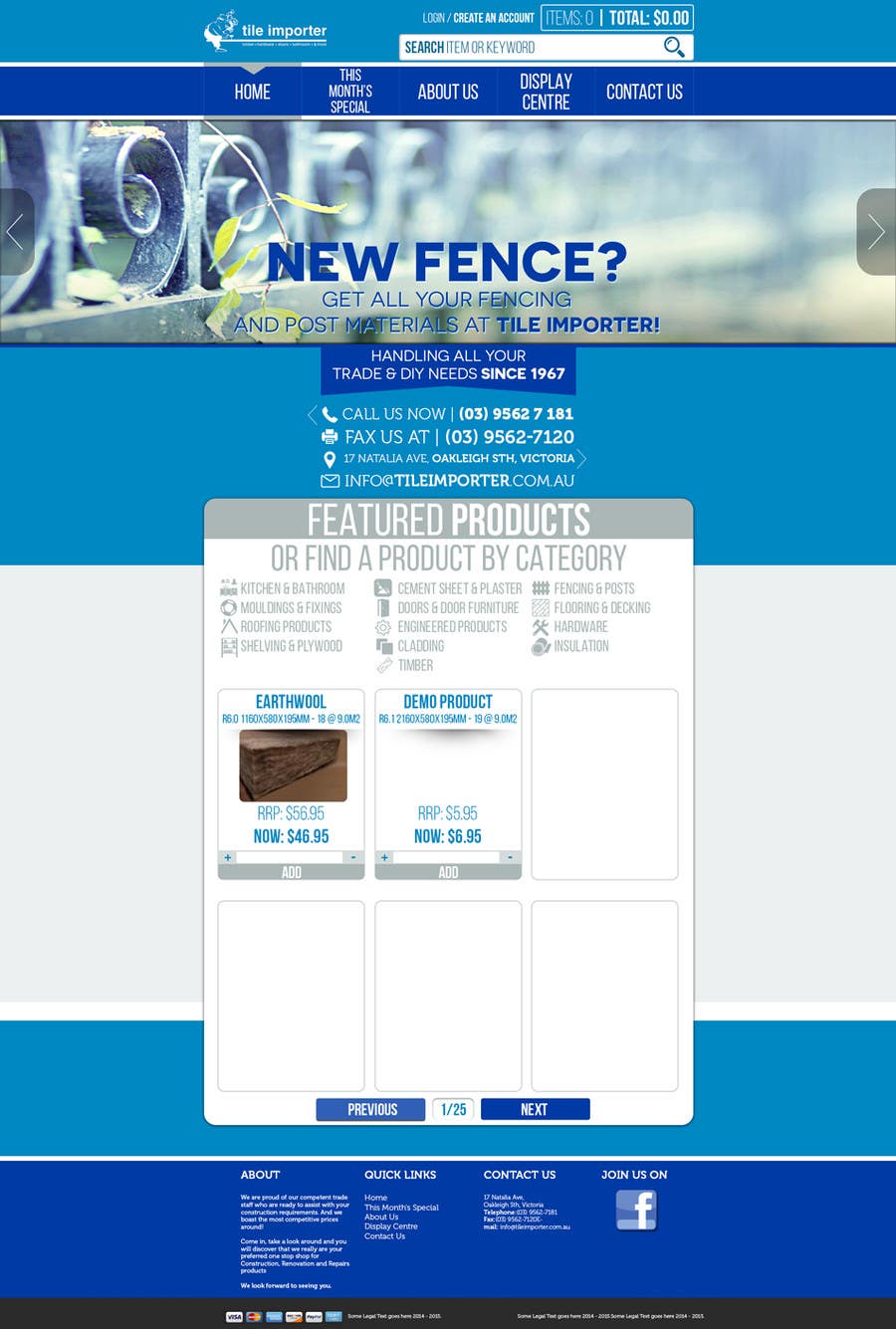
Contest Entry #9 for                                                 Design A Website Skin as Per Requirements.

Public Clarification Board

  • MladjaCode
    MladjaCode
    • 9 years ago

    /// Update 3 /// There's also this version that I've made, where products are not centralized like in the original. I personally don't like that, because products tends to be all over the place in bigger desktop resolutions and it's hard for users to follow them. But you be the judge. You'll get them both of course. Kind regards. MladjaCode. /// http://i.imgur.com/0KviUom.png ///

    • 9 years ago
  • MladjaCode
    MladjaCode
    • 9 years ago

    //// Here's for the product page: http://i.imgur.com/zt4kCIC.png /////

    • 9 years ago
  • MladjaCode
    MladjaCode
    • 9 years ago

    Oh, and one more thing that I forgot. There's a subtle shadow and rounded frame for every product image. So when you import that from the original site, all those pictures are going to look awesome. As you can see here: http://i.imgur.com/LUy6zx1.png /// Kind regards. MladjaCode

    • 9 years ago