JakiZack
Indonesia

This contest is about very - very - small design improvements and html5-cleanup to an working demosite.
I want to improve the design (just a little) and the html5/boostrap 3/jquery quality (a lot) of this mockup-design on this demo-website: http://serverdrift.it/bildebank (should be responsive)
LESS IS MORE
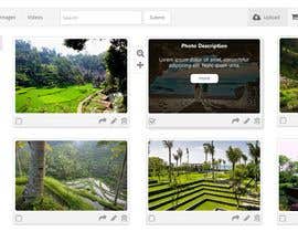
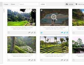
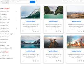
We are mostly talking small touch-up/improvements regarding the design. Keep it super-simple like it is. Colors are only ment to pop-out and be extra eye-candy when used - I think we can avoid colors by default, but have it on the upload page and few other places. Keep the air (white space) similar to what it is. Light. It is all about the content/the images - that is what important. So need a nice, descrete frame around it, almost like it is now.
On the website above, I have just used quick and dirty html5/bootstrap/jquery to get the design/mock-up/wireframe working in FireFox and to show you all the content basically. YOU must do it professional - you will see a lot of issues in other browsers and I want improvements to the design to make it flow better. So you should make both the design and the html5/bootstrap version 3/jquery-coding from ground up using my concept-design and your design-improvements if you win.
As little colors as possible - if any. I use Bootstrap 3 because I like the colors better (less flashy/glory - like white/primary in BS3 - a bit faded/discrete colors like that). Default gray or shades of gray can be used a lot and possibly/maybe dark navy blue/primary at max (search button looks nice with default bootstrap button like now). Look at the upload-image page as well, no more colors than that, it is the max. I like that blue on that page.
All users are normally logged in and can perform different actions on this kind of control-panel.
The left categories should be selectable by click and expand/select top-level-checkbox and any sub-folders on click. Tags is just normal tags, could be many of them.
IMPORTANT #1:
Please show examples of different image sizes so I can judge this important part of the project.
IMPORTANT #2:
Font-type is everything in this project since there are so little "design" in the webpage. Notice the gray-isj color I have in the left menu for folder-text, I like that better than black (also for input boxes). Google-fonts are often nice, but keep it clean/formal and use bootstrap-components - without any/to much javascript. HTML5 and bootstrap should by practically all the html.
-------------
Give me your best GUI-design. If you win, you must to code it in html5/bootstrap/jquery - kind of working mock up that would keep the selected folders/sub-folders as far as possible, so that you almost get an impression of everything working.
If you want to show a different state (for instance on the input-boxes/folders), you can show me example from other websites. Any method to show me how you intend to solve the task will help your design if you can't draw it easly.
I gotten inspiration of check boxes Finn.no:
https://www.finn.no/realestate/plots/search.html
“Got the job done.”
![]() DeltaUser, Norway.
DeltaUser, Norway.


Post Your Contest Quick and easy

Get Tons of Entries From around the world

Award the best entry Download the files - Easy!
