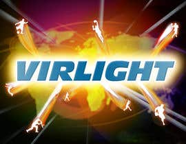
Graphic Design for Virlight
- Status: Closed
- Prize: $200
- Entries Received: 6
- Winner: Guxalin

Contest Brief
news sports website
Recommended Skills
Employer Feedback
“nicely done”
![]() kmaxis, Netherlands.
kmaxis, Netherlands.
Public Clarification Board
-

reshmaPatel2005
- 11 years ago
hi,
Can you please review #58- 11 years ago
-
reshmaPatel2005
- 11 years ago
Hi,
Pls rate #58 .- 11 years ago
-

jazzbigbox
- 11 years ago
http://www.123rf.com/photo_14205121_3d-sphere-with-world-flags.html
- 11 years ago
-
jazzbigbox
- 11 years ago
#47 #48 #49 are based on stock images.
- 11 years ago
-
hasif1
- 11 years ago
Dear kmaxis: checkout some fresh options #47 #48 #49
- 11 years ago
-

azkaik
- 11 years ago
feedback for #39
- 11 years ago
-

Contest Holder - 11 years ago
a black or dark background is not a reuirement, you can also work if you like on lighter version. Keep in mind that we want to have 2 major colors (blue should be one, possible some shades of dark grey as well), then a some light use of other color to give sense of excitement, activity and markup, even if slightly , the concept of movement. The icons that you use for the sports, you can use balls, players outlines or fills, or a mix...but it needs to be clear and each separated from the other.Graphics needs of be of quality, better if custom made. Thanks
- 11 years ago
View 2 more messages
-
Contest Holder - 11 years ago
or multiple...so a group of explosions :-)
- 11 years ago
-
azkaik
- 11 years ago
ohh so u made that picture?? u r claiming the copyright?? i made that picture and i hold the copyright..mind your own business
- 11 years ago
-

WebofPixels
- 11 years ago
I never said I made the picture. I never said I had copyright. I did however clearly imply that this was not an original image.
If what you say is true about you "making" the picture and "holding" the copyright then please explain the drastic change in styles within the submission. "Your" background is highly detailed and artistic while the juxtaposition of the other pieces are clearly superimposed and floating with no relation to the remainder of the image and ultimately are at a very poor design standard. "ohh" How is this possible?
Obviously you are bluffing otherwise you would not have withdrew from the competition.- 11 years ago
-
Contest Holder - 11 years ago
LOGO: it doesnt have to be THAT big...
- 11 years ago
-
Contest Holder - 11 years ago
yeah,only keep alive the ones that are clearly on track , so that other designers may also better grasp in which direction to move.The ones that are now left have grasped the concept best, although we are not yet there...we need to utilize more the space pace, reduce logo size, and lighten up the entire look from the DARK current levels. Sorry for the confusion
- 11 years ago
-

rajatibs
- 11 years ago
no problem sir,i will keep on trying with more designs,as i am in urgent need of money
- 11 years ago
-
Contest Holder - 11 years ago
hi rajatibs...the concepts are ok, but they are too busy and the quality of the images/graphs are too low right now..
- 11 years ago
-
rajatibs
- 11 years ago
sir,will remove the extra crowd from it,the iamges are low quality because the high resolution file is too high in size to uplaod,once selected will give you correct density file
- 11 years ago
-
Contest Holder - 11 years ago
thanks for the explanatino, I didnt know...it's my first contest.. Apologies
- 11 years ago
-
jazzbigbox
- 11 years ago
Hmm will submit my entry soon..
- 11 years ago
-
Contest Holder - 11 years ago
thanks, looking forward to it.
- 11 years ago
-
thuanbui
- 11 years ago
hi sir!
please check #18 #19
thanks sir!- 11 years ago
-
Contest Holder - 11 years ago
hi there, thanks for partecipating, the presentation of #18 is interesting, has that HTML5 feeling that we are looking for if possible...but we need toincorporate the concept of "global" and remove some things, it's too crowded
- 11 years ago
-
rajatibs
- 11 years ago
plz see entry no.17 and give feedback and rating
- 11 years ago
-
rajatibs
- 11 years ago
plz see my design no.9 and give feedback
- 11 years ago
-
Contest Holder - 11 years ago
I will not be available for the next 3 hours, until 10:00 Amsterdam time
- 11 years ago
-
Contest Holder - 11 years ago
Hi Guxalin, thanks for the entry. i'm not completely sold on the icons type...not sure that's what we're looking for ... wanted to feel a little more professional / qualitatitve....custom sports icons are a key i think. Also would be interesting to see a variation of the dark one , but with more colors brought into the "light" and "shining" and "ray lights" so to make the whole things a littleless dark and a little more colorful....want to remain "powerful" like it is now, but it is going to provide entertainment so....colors are fun
- 11 years ago
-

Guxalin
- 11 years ago
Thank you fr your feedback, I'll resubmit the works soon
- 11 years ago
-
Guxalin
- 11 years ago
The stock shots will be purchased and retouched in, on the final stage. Thanks
- 11 years ago
-
Guxalin
- 11 years ago
#5 Thank you
- 11 years ago
-
Contest Holder - 11 years ago
$200 for copy, small mods and paste would be steep. We can do that ourselves, we have that knowledge of photoshop. But when it comes down to actually "making" graphics , that's what we lack, and that is what we need from this project. Sorry if it wasn't clear earlier. Hope you can still partcipate, otherwise thanks a lot for the try. Maybe next time
- 11 years ago
-
azkaik
- 11 years ago
it is high detailed..:/
- 11 years ago
-
Contest Holder - 11 years ago
hi there,
thanks for the effort. But we are looking to have a "white sheet" taken and start with a brush to make us something custom, no clipart, or if used, they have to be coherent and of high detailed quality....I hope the budget is sufficient and that the project was categorized properly.- 11 years ago
-
azkaik
- 11 years ago
#4 i corrected that,,,tell me if you want more improvements..:)
- 11 years ago
-
azkaik
- 11 years ago
oops i wrote ver instead of vir..
- 11 years ago
-
azkaik
- 11 years ago
check #3
- 11 years ago
-
Contest Holder - 11 years ago
"explosion"....or "point of exit" could be vertical, horizoltal oblique...also open to these three different variations
- 11 years ago
-
Contest Holder - 11 years ago
These general guidelines are valid for all designers.
Azkaik on the next design, unless there are general feedbacks, i'll giv them on the entry directly....it's my first contest, I learning how it works- 11 years ago
-
Contest Holder - 11 years ago
thanks
- 11 years ago
-
azkaik
- 11 years ago
yep i'm trying my level best to do it best:)
- 11 years ago
-
Contest Holder - 11 years ago
or a burst through light? no idea what that could look like or if it will look good ... just brainstorming of possible options
- 11 years ago
-
Contest Holder - 11 years ago
more like a burst through air, or air mixed with liquids rather than a burst through a solid matter
- 11 years ago
-
Contest Holder - 11 years ago
thank you, your work is highly appreciated :-) one more thing: about the "explosion"....we want to see it smooth, not edgy....the whole image needs to be smooth, cured in details, with a nice "flow"....it has to give the sens of motion, movement, of "happening" naturally, in real life... that's it :-)
- 11 years ago
-
azkaik
- 11 years ago
thanks..:) you will find your desired design within 1 hr i hope :) m working on it..hard..
- 11 years ago
-
Contest Holder - 11 years ago
I do like this kind of the placement and spacing work that allows space for eventual subtitles, and small descirption / few links
- 11 years ago
-
azkaik
- 11 years ago
ahaan ok i'm gonna brighten it up and think something to handle the sports vectors:)
- 11 years ago
-
Contest Holder - 11 years ago
for the logo, we'd lieke a high impact , "heavy" font ... ideally you can also play with the "LIGHT" word/concept and more with the "VIR" (virtual) concept
- 11 years ago
-
Contest Holder - 11 years ago
altought darkness as the "center of explosion" i good, the overall thing is a little too dark...
- 11 years ago
-
azkaik
- 11 years ago
if i use the sports vectors around the logo then the logo should b large or the vectors would b smaller..what would you like?? and also tell is the logo alright?
- 11 years ago
-
Contest Holder - 11 years ago
by the way, the flags as a planet could be an option as it gives the sens of "global" also in its design
- 11 years ago
-
azkaik
- 11 years ago
ok i got your idea..do you like the background or want me to change it?
- 11 years ago
How to get started with contests
-

Post Your Contest Quick and easy
-

Get Tons of Entries From around the world
-

Award the best entry Download the files - Easy!