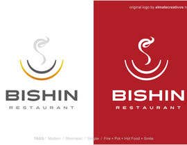
Japanese hot pot restaurant logo
- Status: Closed
- Prize: $385
- Entries Received: 95
- Winner: elmatecreativos
Contest Brief
A Japanese hot pot restaurant logo.
Attached are explanation to support your idea.
1. Basic requirements
- Name of the restaurant: bishin or BISHIN
- Meaning: Bishin is 美心 in Japanese. 美(bi) means beauty 心(shin) means heart.
- Preferred color: Darker red such as #9B003F or see http://bit.ly/2jsdovq
- No Japanese character is needed in logo design
- We require color/black and white logo
2. Design production materials
This restaurant's main menu(01.JPG,02.JPG)
Chicken hot pot with collagen. Main target of this restaurant is 20 - 35 young women who care about beauty. Collagen is an important suggestion in it's menu.
Possible competitor's graphic image (03.JPG)
These images are possible competitor's visual image. See more at
http://tsukadanojo.asia/en
Collagen images (04.JPG)
Chiken(05.JPG)
This restaurant cooks with natural chicken not produced at factory.
Organic vegetables (06.JPG, 08.JPG)
Materials are important. Organic vegetables are served with hot pot
Some visual reference (09.JPG-11.JPG)
Japanese restaurant's visual images we prefer
Recommended Skills
Employer Feedback
“Very good response and flexible to work with our requests. Thank you.”
![]() bridgesystem, Vietnam.
bridgesystem, Vietnam.
Public Clarification Board
How to get started with contests
-

Post Your Contest Quick and easy
-

Get Tons of Entries From around the world
-

Award the best entry Download the files - Easy!


