Soccer Club New Modern Logo

  • Status: Closed
  • Prize: $50
  • Entries Received: 54
  • Winner: AbdelrahmanHMF

Contest Brief

LESS is MORE..!!


We need a new MODERN logo for our club.
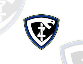
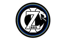
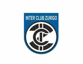
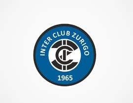
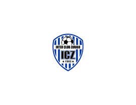
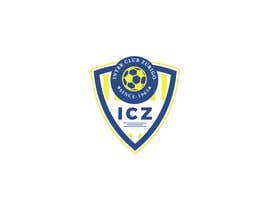
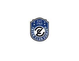
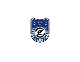
we are Inter Club Zurigo and we have similar colors and logos as the soccer club Inter from Milano
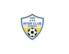
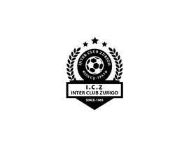
Attached you find the old logo and a few inspirations.

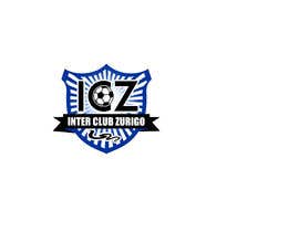
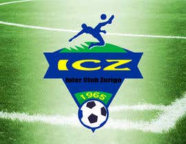
the letters ICZ should be visible in the logo.
and if a snake fits in the logo, the better, but not a must
and the year 1965 or just 65 also

it does not need to be round, other shapes allowed

main colors are:
black #000000
blue #003399
white #FFFFFF
(and very little of yellow #FFFF00 or nothing)

Recommended Skills

Employer Feedback

“Super and I will hire him for future work.!”

Profile image gozuri, Switzerland.

Top entries from this contest

View More Entries

Public Clarification Board

  • Zerooadv
    Zerooadv
    • 5 years ago

    kindly check #51

    • 5 years ago
  • Zerooadv
    Zerooadv
    • 5 years ago

    Still Working ....

    • 5 years ago
  • ALLISHAH
    ALLISHAH
    • 5 years ago

    #38

    • 5 years ago
  • ALLISHAH
    ALLISHAH
    • 5 years ago

    do have a look at #37

    • 5 years ago
  • planzeta
    planzeta
    • 5 years ago

    please check #33

    • 5 years ago
  • planzeta
    planzeta
    • 5 years ago

    please check #32

    • 5 years ago
  • gozuri
    Contest Holder
    • 5 years ago

    look at the description of the contest

    • 5 years ago
    1. hasanjahedi100
      hasanjahedi100
      • 5 years ago

      i already read your description but you give 4 star rating that logo color are not the same that you provide color code . my entry #9 is the color according to your color code . you think that what you want . you provide pure black color code but your previous color was gray not pure black . i hope you understand

      • 5 years ago
    2. hasanjahedi100
      hasanjahedi100
      • 5 years ago

      I am also trying to give you new concept

      • 5 years ago
  • hasanjahedi100
    hasanjahedi100
    • 5 years ago

    you provide pure black color and blue color that combination are not matching . only yellow and blue combination is looking better . but in your previous logo its a gray , blue and yellow . what do you think now ? please response

    • 5 years ago
  • gozuri
    Contest Holder
    • 5 years ago

    less is more
    it doesn't need to be round, other shapes are allowed

    • 5 years ago
  • hasanjahedi100
    hasanjahedi100
    • 5 years ago

    What you like circle logo or different ?

    • 5 years ago

Show more comments

How to get started with contests

  • Post your contest

    Post Your Contest Quick and easy

  • Get tons of entries

    Get Tons of Entries From around the world

  • Award the best entry

    Award the best entry Download the files - Easy!

Post a Contest Now or Join us Today!