Traveling teddy bear logo design

  • Status: Closed
  • Prize: €50
  • Entries Received: 32
  • Winner: Mwooo

Contest Brief

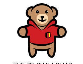
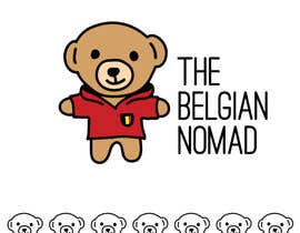
I need a logo for the teddy bear in the travel Instagram account @TheBelgianNomad (https://www.instagram.com/TheBelgianNomad/)

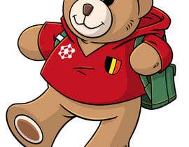
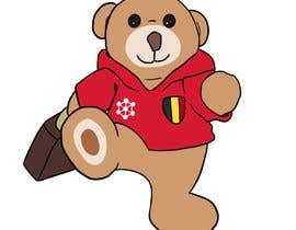
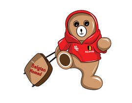
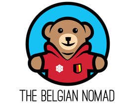
The logo can feature the teddy bear only, or with additional elements related to travel, such as the Earth or a backpack, for instance. That said, I would like the logo to remain relatively simple and elegant, without an excessive amount of details.

I'm willing to consider non-obvious angles, such as the teddy bear from the top, side or back.

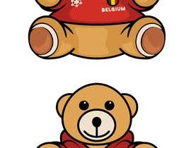
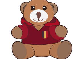
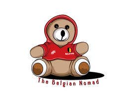
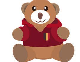
Hood on or off is accepted (see attached pictures). If designed to see the front of the teddy bear, unless naturally hidden by an additional design element, the simplified Atomium logo (to the left; hexagon with circles at the vertices and in the center) and the Belgium flag/text are required. That said, the flag should ideally be at least partly visible, even if there is something in front of the teddy bear.

Text ("The Belgian Nomad") is optional.

UPDATE: He must wear the sweater (with or without hood) and there must absolutely be a likeness, not to any teddy bear, but to this one in particular. I want people who see it to immediately notice the link/likeness between the logo and teddy bear they're used to see in pictures.
Please do no use gradient shading, but rather flat colors.
This is the first contest I'm holding, so I hope I'm detailed enough in this description, but don't hesitate to let me know if you have questions before starting to work on it, and I'll do my best to answer ASAP.

Recommended Skills

Employer Feedback

“I appreciated Ilya's professionalism and how fast he reacted to my feedback, not only making requested changes, but proposing a couple of different designs. I recommend working with him, and would definitely hire him in the future if I need further design work done.”

Profile image TheBelgianNomad, Belgium.

Top entries from this contest

View More Entries

Public Clarification Board

  • binsonmp
    binsonmp
    • 4 years ago

    #57 also.

    • 4 years ago
  • binsonmp
    binsonmp
    • 4 years ago

    Please check my entries #55 , #56 . Thank you.

    • 4 years ago
  • binsonmp
    binsonmp
    • 4 years ago

    Please check my entry #50 , #51

    • 4 years ago
    1. TheBelgianNomad
      Contest Holder
      • 4 years ago

      My apologies for the long delay in commenting!

      • 4 years ago
  • smartmunna
    smartmunna
    • 4 years ago

    check entry #38

    • 4 years ago
  • TheBelgianNomad
    Contest Holder
    • 4 years ago

    Thank you to all those who've posted entries so far, or are working on this logo and have yet to post.
    I really want to stress again the point that likeness to the actual teddy bear is of utmost importance to me. And this is why I rejected so many designs already; some are very fine, but bear not resemblance at all to my teddy bear.
    To give you just an idea how important it is, first of all his Instagram followers and I would never called this teddy bear 'it', but 'he'. He speaks as first person on HIS instagram account, people call him Nomad (his nickname) and followers regularly make comment about how he looks depending on the angle at which he is shot in the pictures, sometimes giving him a happier or sadder look. I know that might seem odd to some people, but that's how it is ;)

    • 4 years ago
    1. TheBelgianNomad
      Contest Holder
      • 4 years ago

      When they see the logo, I want his followers to immediately think "Wow, it's him!"
      So far (only on day 2), and though not perfect, #14 and, to a lesser extent, #6 can be seen like that. But also, in a totally different style, #19 , which obviously looks like Nomad. This to show that it doesn't mean the logo should be photo-realistic, far from it.
      I'm open to different styles, some maybe even very minimalist, and I definitely won't rush into chosing the winner, so you have time to come up with new ideas and surprise me. But, I repeat, the one thing that is most important, whatever the style, is for me to think at first look "It's Nomad!"

      • 4 years ago
    2. TheBelgianNomad
      Contest Holder
      • 4 years ago

      One thing I've noticed in many entries, and that should probably be adjusted to some extent, is the mouth. It's not obvious in the pictures (sorry!), but it's just one curve from left to right (with one vertical line down from the nose), instead of two linked in the middle. That gives him more an impression of smile. I'm not 100% against using two curves, but they should be attenuated in the middle. It's more obvious how the mouth is in some pictures on his Insta account, for instance this one: https://www.instagram.com/p/By0qaL5hIiZ/

      • 4 years ago
  • AsmaKhalid90
    AsmaKhalid90
    • 4 years ago

    Hello, I've uploaded my logo design with different options..Please have a look

    • 4 years ago
    1. TheBelgianNomad
      Contest Holder
      • 4 years ago

      Thanks for your entries. However, I really want it to be immediately recognizable, but there is no likeness between those logos and the actual teddy bear.

      • 4 years ago
  • mdrofiqul99
    mdrofiqul99
    • 4 years ago

    please check #22

    • 4 years ago
  • mrstheboss
    mrstheboss
    • 4 years ago

    Working

    • 4 years ago
    1. TheBelgianNomad
      Contest Holder
      • 4 years ago

      OK, thanks ;)

      • 4 years ago

Show more comments

How to get started with contests

  • Post your contest

    Post Your Contest Quick and easy

  • Get tons of entries

    Get Tons of Entries From around the world

  • Award the best entry

    Award the best entry Download the files - Easy!

Post a Contest Now or Join us Today!